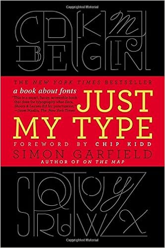
 While reading a book recently about typefaces [Just My Type], it became apparent the font used to denote the squash/gourd designation could add another layer of meaning to the table. For example, a sans serif face might suggest a basic need such as food whereas a blackletter face such as Santas Humanum Salvator would visually describe a more decorative purpose.
Wednesday, April 19, 2017
another layer of meaning...
While reading a book recently about typefaces [Just My Type], it became apparent the font used to denote the squash/gourd designation could add another layer of meaning to the table. For example, a sans serif face might suggest a basic need such as food whereas a blackletter face such as Santas Humanum Salvator would visually describe a more decorative purpose.
Subscribe to:
Post Comments (Atom)
No comments:
Post a Comment